
Sunday, December 13, 2015
Friday, December 11, 2015

Tuesday, December 8, 2015
The first logo I'd like to discuss is the Starbucks logo. Starbucks is a massive coffee that has quickly spread across the country and the world. The company originated in Seattle, Washington. Their logo features a white colored woman with a crown. The logo only features two colors, green and white. Although you cannot tell from the most recent version of the logo, one glance at the original would show that the striped shapes on the left and right side of the design are supposed to be the tails of a mermaid, which means the the woman is really a mermaid. Twin tailed mermaids are also known as sirens. It is presumed that the target audience of this logo is white girls and women. I believe that their logo is extremely effective based on the amount of people, especially white women, who buy Starbucks daily.

Second, I'd like to discuss the Walt Disney logo. The entire logo is black with white spacing. The first thing to notice is the font that is used. It is one of the most recognizable fonts in the world. The font is rather childish in a way. Adding to the "childishness" of the logo is the castle in the background of the logo. It is the same castle that you find at Walt Disney world in Orlando, Fl. The target of their logo is indeed children.I believe that because of the obvious success Disney has endured, their logo is quite effective.
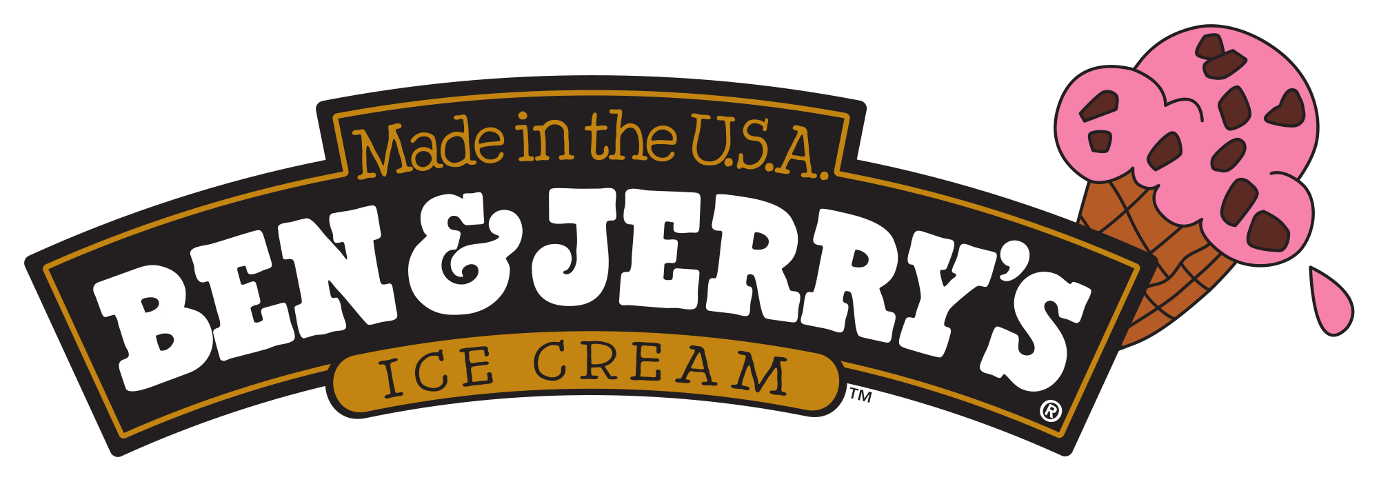
The next logo I'd like to talk about us the Ben and Jerry's Ice Cream logo. Similar to the Walt Disney Pictures Logo, it uses a font to appeal to children. Black, white, a light brown and pink are all used in the logo. As before mentioned, children are the target of the logo and they do this with the picture of the ice cream cone and the childish font. Although effective, I believe that their logo could be more successful.
This is the Anheuser-Busch logo. Anheuser-Busch is an American beer company based in St. Louis, Missouri. The logo features a kingly looking "A" in which a bald eagle is flying through. The obvious purpose of this logo is to appeal to the American man. The company is making the statement that patriotic, country-loving men drink this beer. This is a very successful advertisement because it subliminally attracts men who think of it as a manly, patriotic drink.

The final company logo I'd like to discuss is the Dodge logo. Dodge is an American car company. Their logo is rather simple. It features a ram surrounded by a pentagon. It is red and white, with the words "Dodge" in black. The target of this audience is "tough" men. Ram's a viewed as tough animals so it is understandable why logo is a ram. Their logo is relatively effective, but their are much more effective logos out there.
Monday, December 7, 2015

Wednesday, December 2, 2015

Tuesday, December 1, 2015
Tuesday, September 29, 2015

Subscribe to:
Comments (Atom)